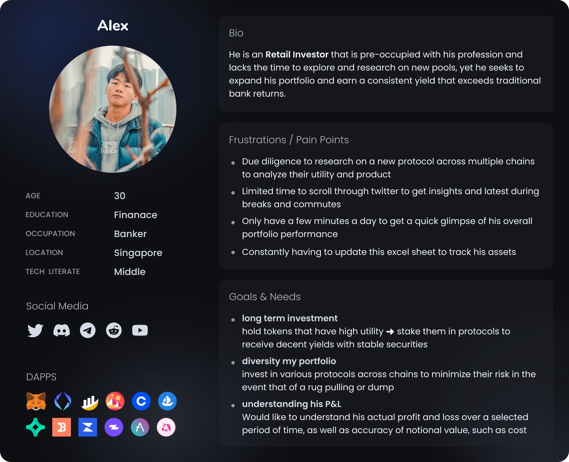
As a DeFi user, the complexity and technical jargon associated with DeFi can be overwhelming. Furthermore, with my investment spread across multiple chains and protocols, it is challenging to track the risks and rewards of each investment. As a result, I feel uncertain about the profitability of my portfolio, which hinders my ability to maximize my returns and achieve my investment goals.
Surveys
To understand market segment and types of DeFi users based on net worth
User Interview
Arrange an online discussion with users from our discord community
Usability Testing
Assign 3 tasks to our users and observe how they go through each

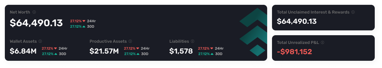
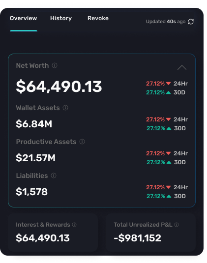
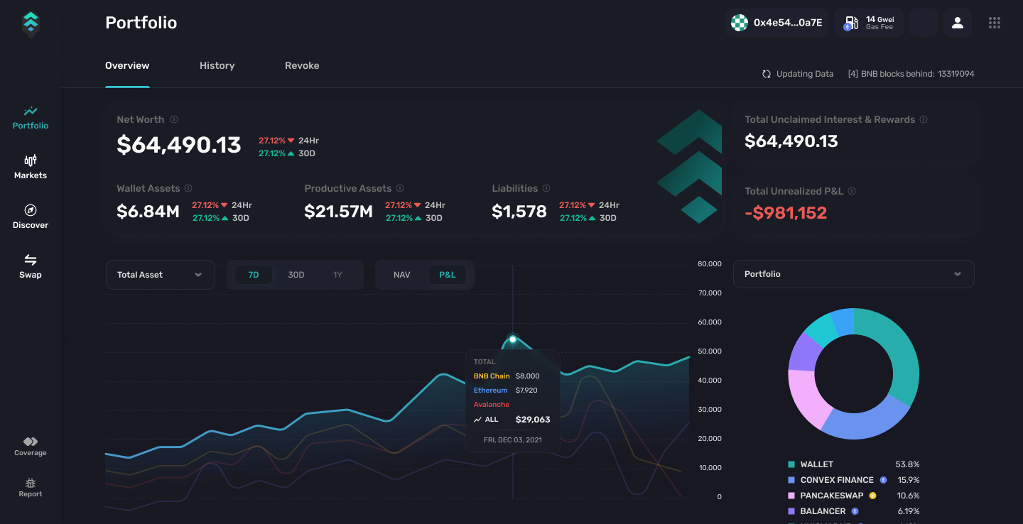
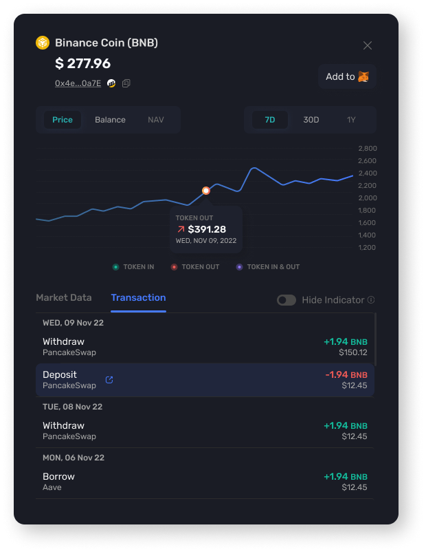
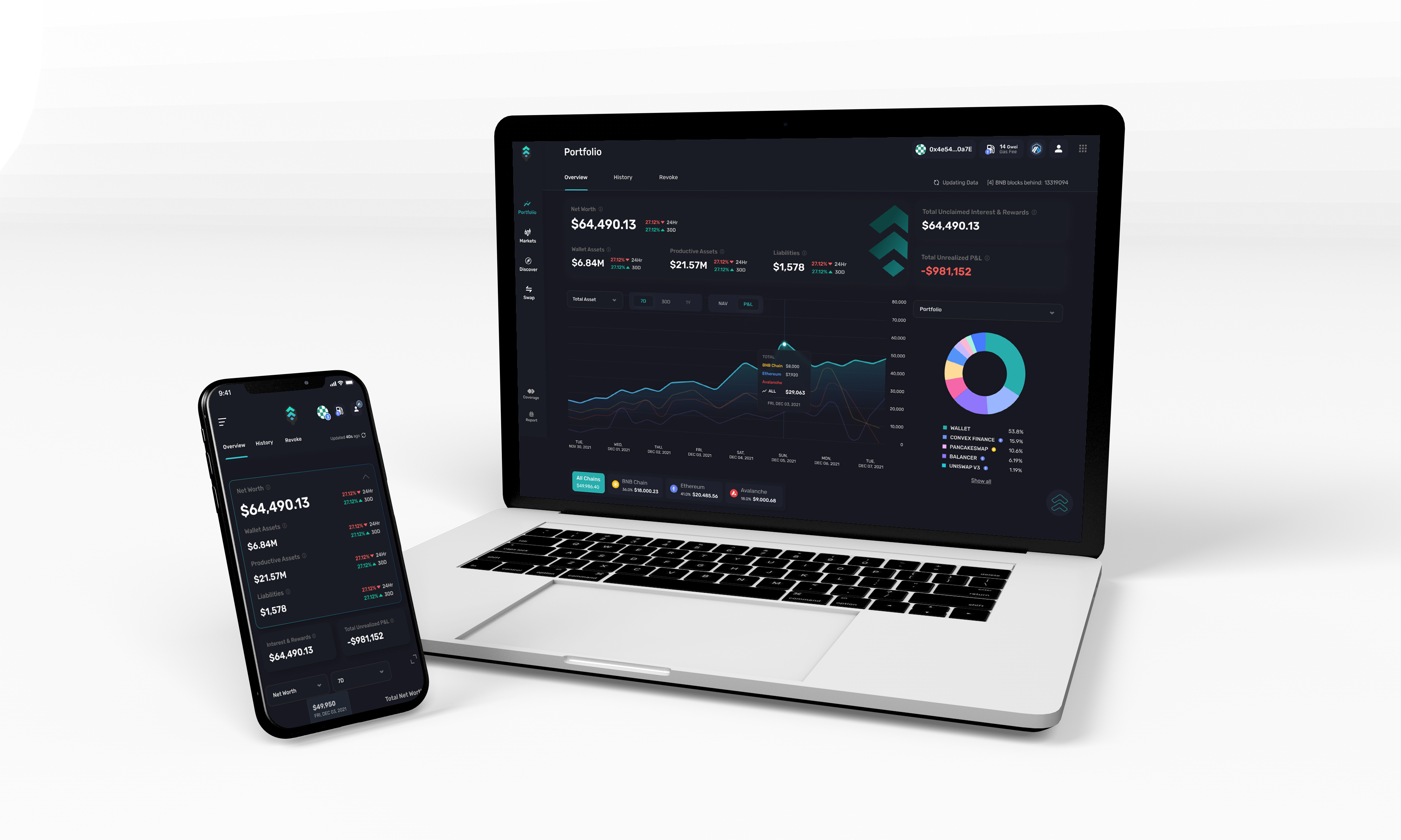
Performance Summary
Quick report of my portfolio performances over the last 24 hours
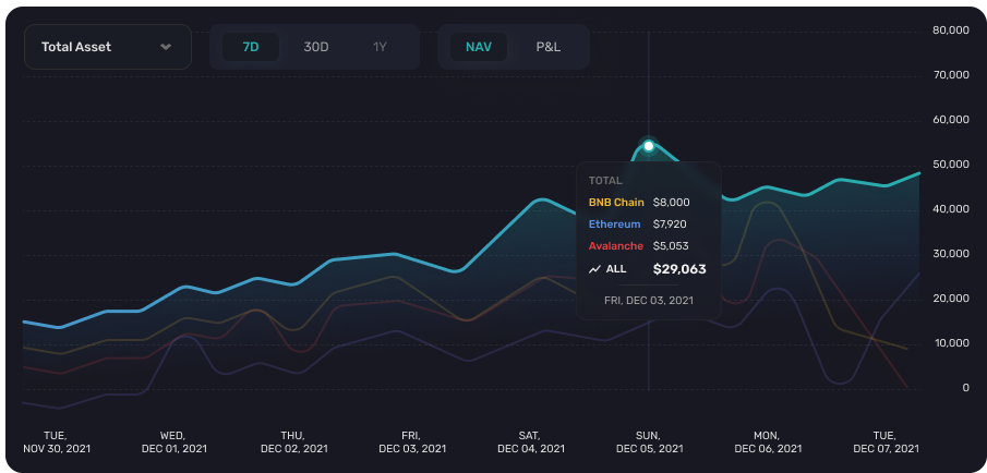
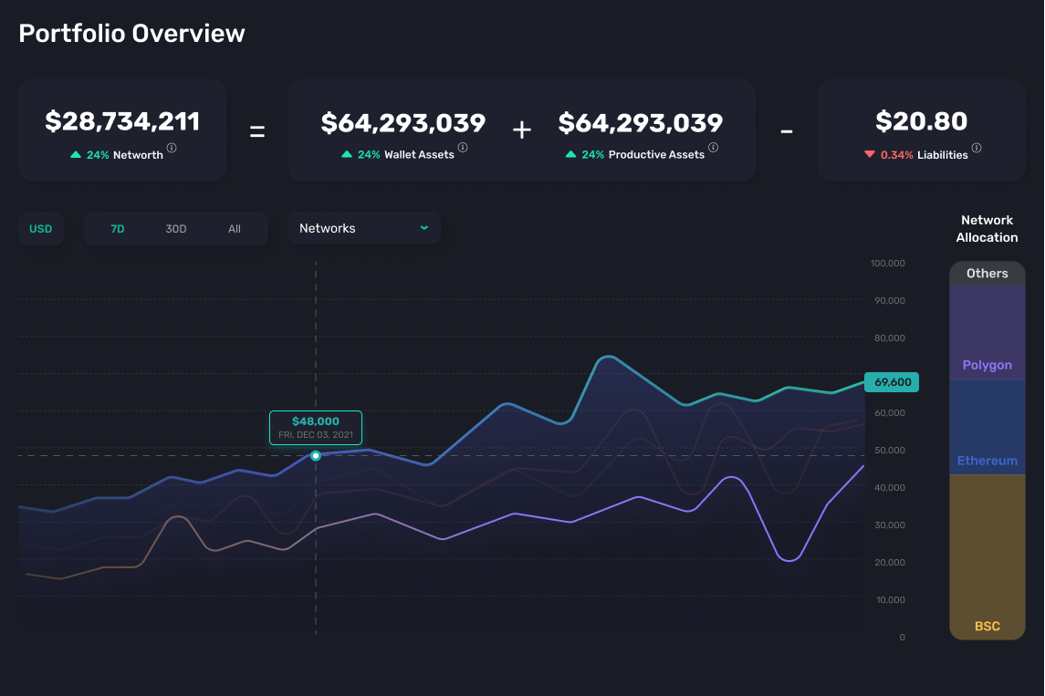
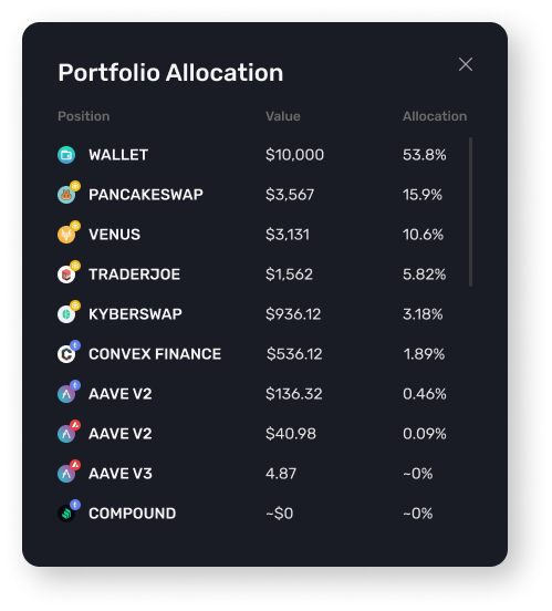
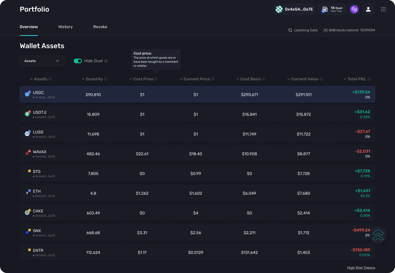
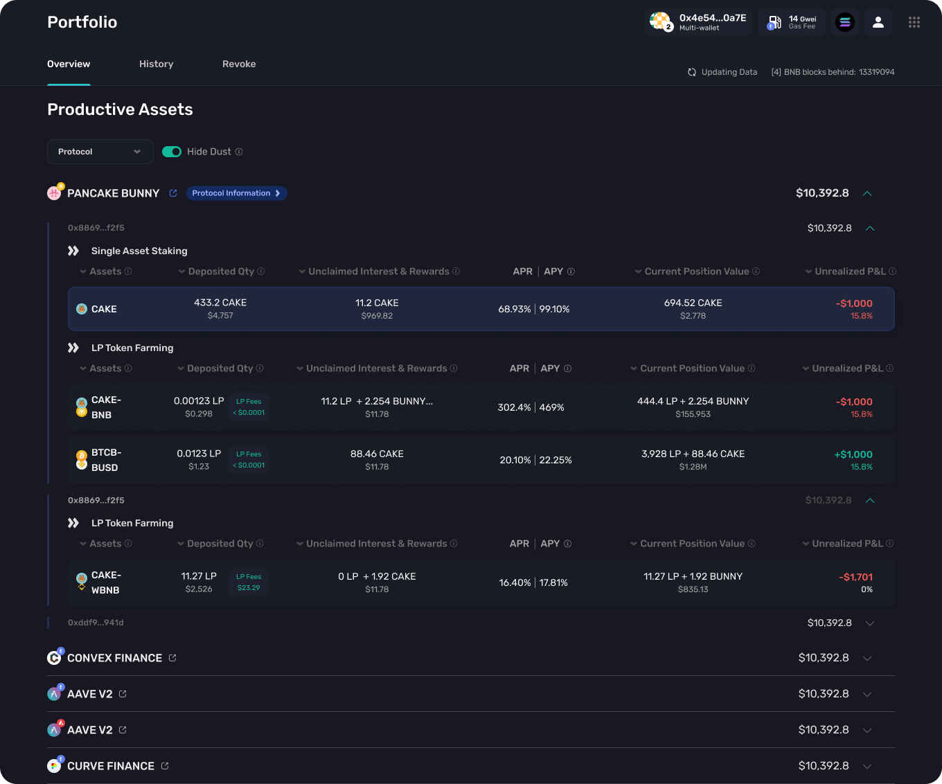
Risk Management
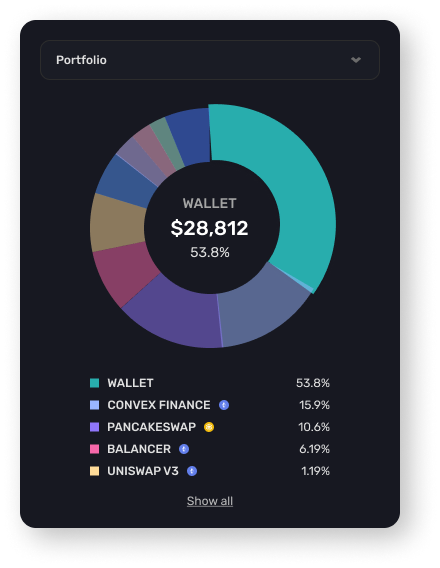
Understand where all their assets are allocated at, which chain, protocol and ratio of tokens
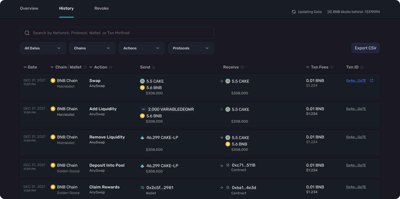
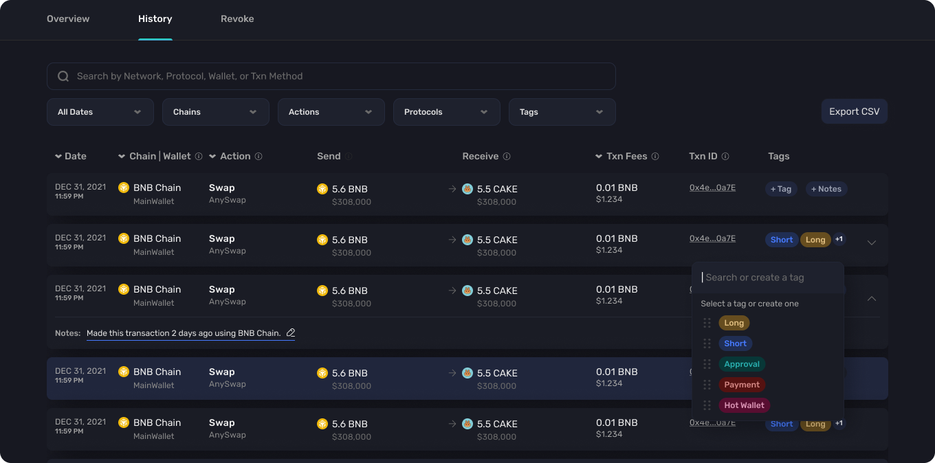
Manage Token Flow
Users can view their transactions made on the blockchain to better manage their in-out flow
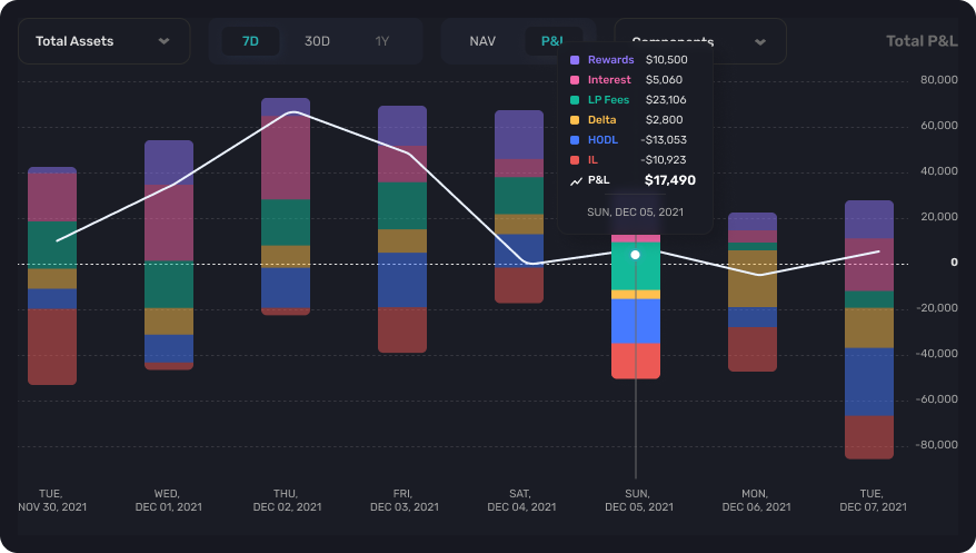
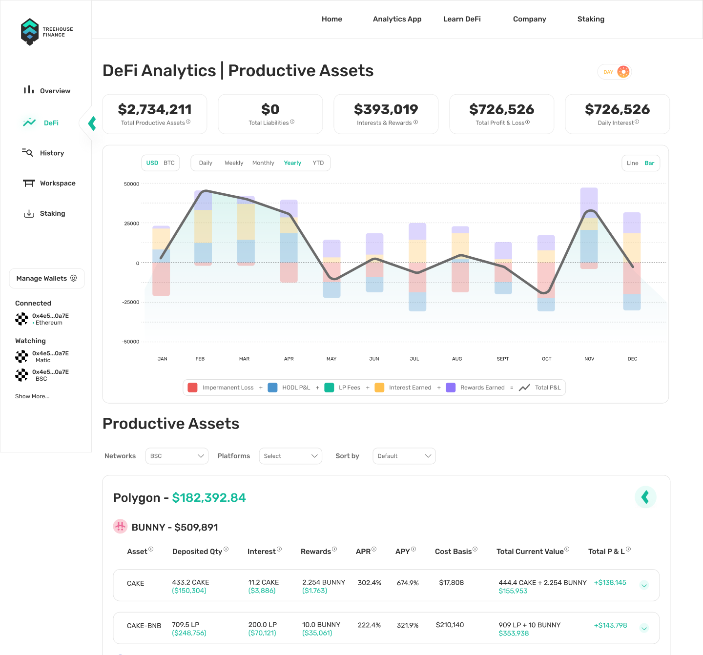
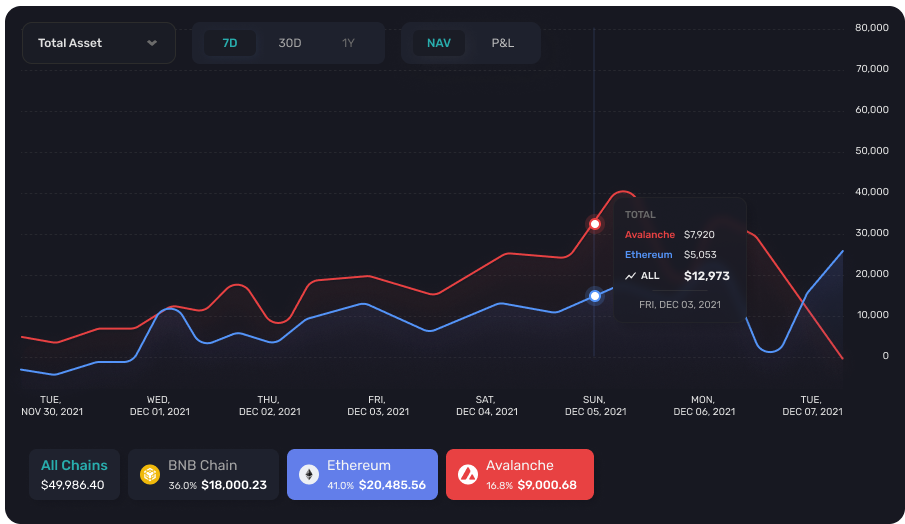
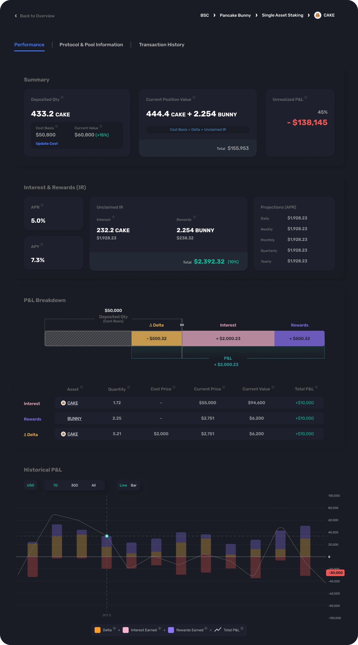
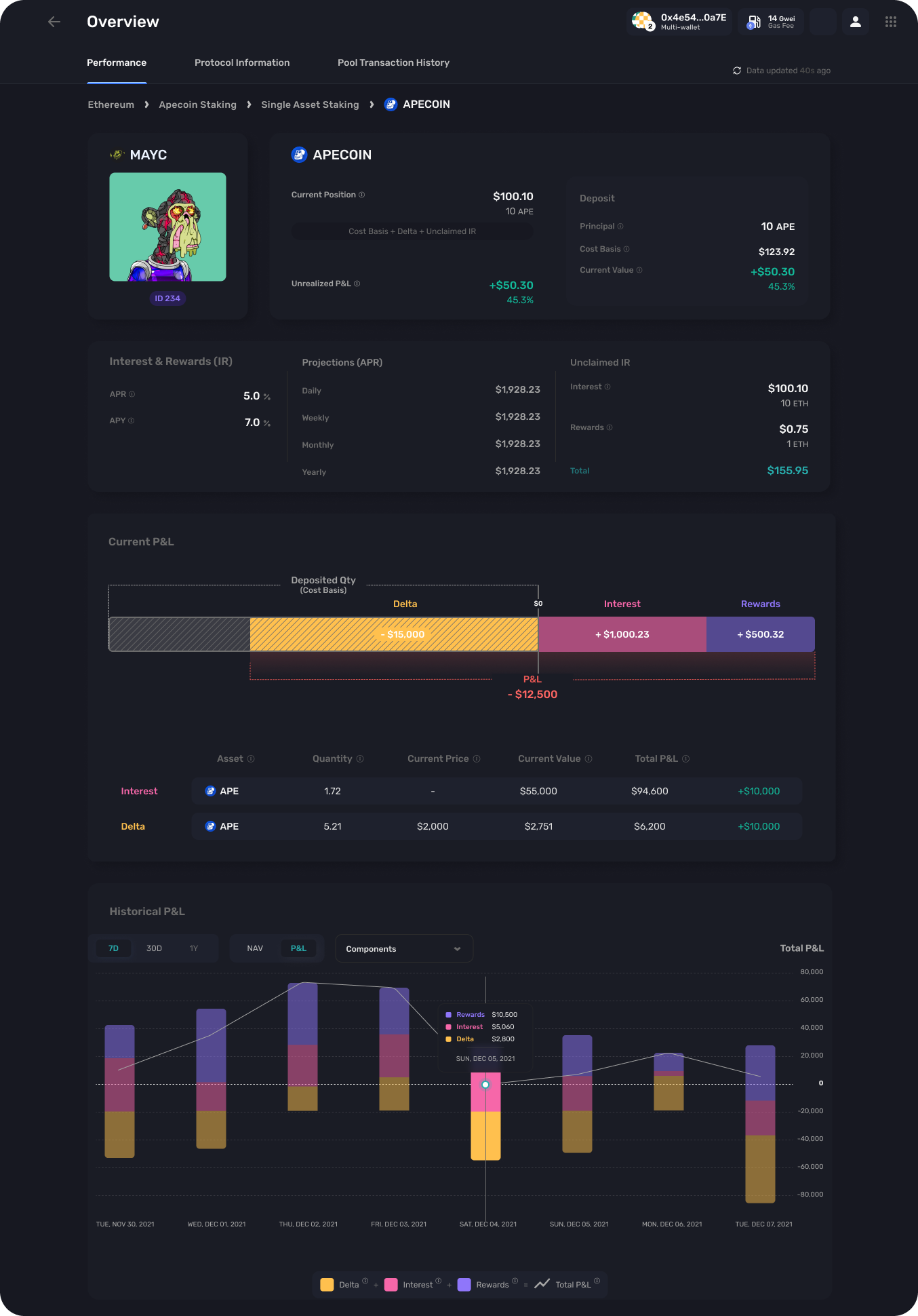
In-depth Analytics
Shows how we break down a user's profit and loss (P&L) and how these calculations were derived